Redesigning the journey around the passenger.
An aviation experience spanning booking, Manage My Booking and online check-in. I worked across UX and UI to reduce friction throughout the journey while still supporting the business goals behind ancillary sales.
- Role
- UX/UI Designer
- With
- Senior UX Researcher
- Duration
- 4 months
- Status
- Handed off to development
When selling gets in the way
Airline journeys have a difficult balance to strike. The business wants to increase ancillary sales, while passengers want to book, manage their trip and check in without being interrupted.
Across the existing experience, offers, pre-selected add-ons, hidden fees and repeated pop-ups were becoming part of almost every step.
The challenge was not simply to remove them.
It was in finding where they genuinely belonged without making the journey harder to complete.
Looking at the journey from multiple angles
I started by looking at the experience beyond individual screens.
I audited four airlines, comparing booking, Manage My Booking and check-in to understand how other products handled similar moments. I also reviewed customer feedback, journey data and existing usability issues with a senior UX researcher.
A PURE expert review helped us walk through the journey step by step and identify where users were likely to struggle.
The same patterns kept coming up.
Too much information, unclear system feedback, and too many moments where selling interrupted the task.
What I found
Transparency was missing.
Users were often unsure what they were paying for, why a price had changed, or whether an add-on had actually been selected.
The journey asked too much.
Long forms, repeated steps and unclear navigation increased the effort needed to complete simple tasks.
The system wasn't always clear.
Errors didn't always explain what had gone wrong, while important actions and status information could be difficult to find.
Selling was happening at the wrong moments.
Ancillary offers appeared throughout the journey, including during tasks where users were simply trying to get something done.
Making booking easier without removing the business
The booking journey had opportunities to reduce cognitive load without removing the commercial parts of the experience. I focused on making the structure easier to understand, while giving users clearer information about what they were selecting and paying for.
Making the journey easier to follow
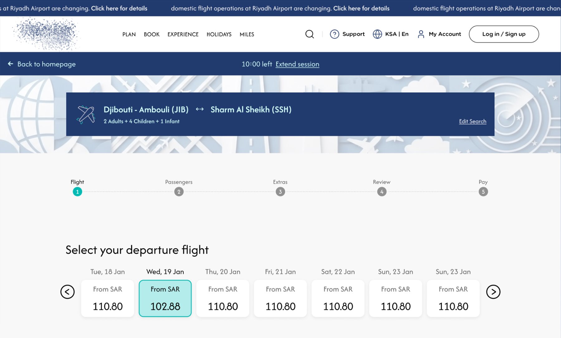
The search experience didn't make important information visible enough, particularly passenger selection and the current stage of the booking. I introduced a clearer search widget and a stepper that shows where the user is and what remains, giving the journey a more familiar sense of progress.
Breaking down passenger details
Passenger forms were long and repetitive, making the booking feel heavier than it needed to be. I separated each traveller into a collapsible section, allowing users to focus on one person at a time instead of facing one large form.
Making extras clearer
Add-ons and seat selection created uncertainty around what was free, what was paid and what had been added. Rather than hiding these details, I made the cost and selection states clearer while keeping opportunities for ancillary sales in the journey.
The goal wasn't to remove the business opportunity. It was to make the choice feel like a choice.
A clearer way to manage an existing booking
Manage My Booking was one of the more frequently revisited parts of the experience, but making a change could involve several confusing steps.
Users had to compare flights, fare options, seats and additional products without always having a clear picture of what would change.
I redesigned the experience around clearer comparison and feedback.
Flight options were presented as cards so users could more easily compare departure and return flights, while changes were reflected directly in the flight summary.
I also reduced repeated promotional interruptions and made price changes more transparent throughout the flow.
If something changes, the user should be able to understand what changed and why before continuing.
Making check-in feel like check-in
Check-in is a different kind of journey. The user isn't exploring anymore. They are trying to get somewhere.
Yet the existing flow included promotional content and add-ons alongside a task that was already affected by strict validation and technical issues.
I made the check-in entry point easier to find and simplified the information needed to retrieve a booking.
The review also surfaced technical issues that could prevent users from completing the retrieval process.
When someone is checking in, the priority should be getting them checked in.
From research to development
After four months across research, UX and UI, the redesigned experience was handed off to development. The work was well received by stakeholders because it addressed the friction users were experiencing while still working within the business requirements of the product.
There are no post-launch results yet, so the real measure of success will come once the redesigned journeys are live.
The biggest lesson for me was that improving conversion doesn't always mean creating more opportunities to sell. Sometimes it means making the journey easier to complete.