Making the trip to the movies start earlier
A movie-booking experience built around how people actually choose where and when to watch. I interviewed moviegoers, audited four booking apps, and designed a flow that makes comparing theaters, showtimes and seats faster, then carries that through to payment, snacks and the ticket.
- Role
- Experience Researcher, Interface Designer
- Scope
- User research, competitive audit, mobile app design
- Tools
- Figma, FigJam
- Duration
- 3 weeks · Personal project
Booking shouldn't be the hard part
I set myself a brief: a cinema chain in Lebanon wants to redesign its mobile app so that booking is easier and its offers actually reach people. Before drawing anything, I needed to understand why people who like movies still hesitate to go.
Why was booking frustrating? Why couldn't people make a quick decision?
My starting assumption was simple. Most reasons people give for staying home can be solved, they just don't know it yet. The research was there to find out which reasons were real.
Planning the research
I wrote a research plan with clear objectives: how people learn about movies, how they choose a theater, how they buy tickets today, and what bothers them most across the whole trip, from the sofa to the seat.
I interviewed 18 adults: couples, parents, people who go alone and groups of friends. The script moved from warm-up, to how they deal with the problem today, to the workarounds they already use.
I tested the script and changed it.
After the first two interviews I reviewed the recordings with a mentor and rewrote the weak questions. One question kept getting answers about the film instead of the theater, so I reworded it around the experience. Another invited wishful answers, so I replaced it with "if you were in charge of this cinema, what would you change?". I also offered Arabic as an option, so people answered in the language they think in.
What the other apps get right and wrong
I audited four apps screen by screen: two local cinema apps (VOX and Grand Cinemas) and two international ones (Fandango and BookMyShow). For each I noted the offering, first impression, features, reviews and where the flow breaks.
- Local apps repeat work. One asks for your name, email and phone again at checkout even when you are signed in, and the price only updates after you confirm your seats.
- Each app covers one chain. You cannot compare theaters, and store reviews complain that you can't see which location shows which movie.
- Fandango shows the decision in one view. Day, showtime and seat availability sit together, and you can ask to be told when tickets go on sale.
- BookMyShow makes seats fast but the app crowded. Tapping a row fills your seats, yet the amount of content makes it hard to find your way.
The gap was clear: nobody locally lets you compare theaters, formats and seats in one place.
Sorting what people said
I pulled every relevant quote onto a sticky note, tagged it with the participant and question, then grouped the notes by meaning. Nine themes came out. The starred note in each group is the quote that says it best.
Interview notes grouped by theme: audience, payment, online booking, queues, proximity, experience quality, seats, offers and concessions. Non-English phrases are blurred.
What kept coming up
Distance picks the theater, the format breaks the rule.
People go to the theater closest to home. The exception is a film worth seeing in IMAX, and then they struggle to find where and when it plays.
The audience makes or breaks the night.
The largest group of notes was about noise, phones and kids. Several people already choose late or weekday showings to avoid a full room.
People want to pay online, and can't.
Cards fail, some sites only take local-currency cards, and many fall back to reserving by phone and paying cash at the counter.
Two queues for one movie.
One line for tickets, another for popcorn. People called it a waste of time and arrive early just to stand in both.
Offers exist but nobody sees them.
Price matters, yet people only learn about offers once they are standing in the theater.
People needed a faster way to compare theaters, and a booking flow that didn't make them go looking.
Two moviegoers
I developed two primary personas that represent the majority of the people I spoke to. Analyzing their behavior and goals let me keep asking the critical question: am I designing the right product?
From deciding to watching
I mapped each persona's journey step by step, from deciding to watch a movie to leaving the theater, with what they do, think and feel at each stage.
Sinon's low point is committing to a booking: he can't pay online and worries about a noisy room. Yasser's comes later: the queue for snacks, then a noisy room. The bottom row of each map lists the opportunities, and those became the screens below.
One screen to compare and book
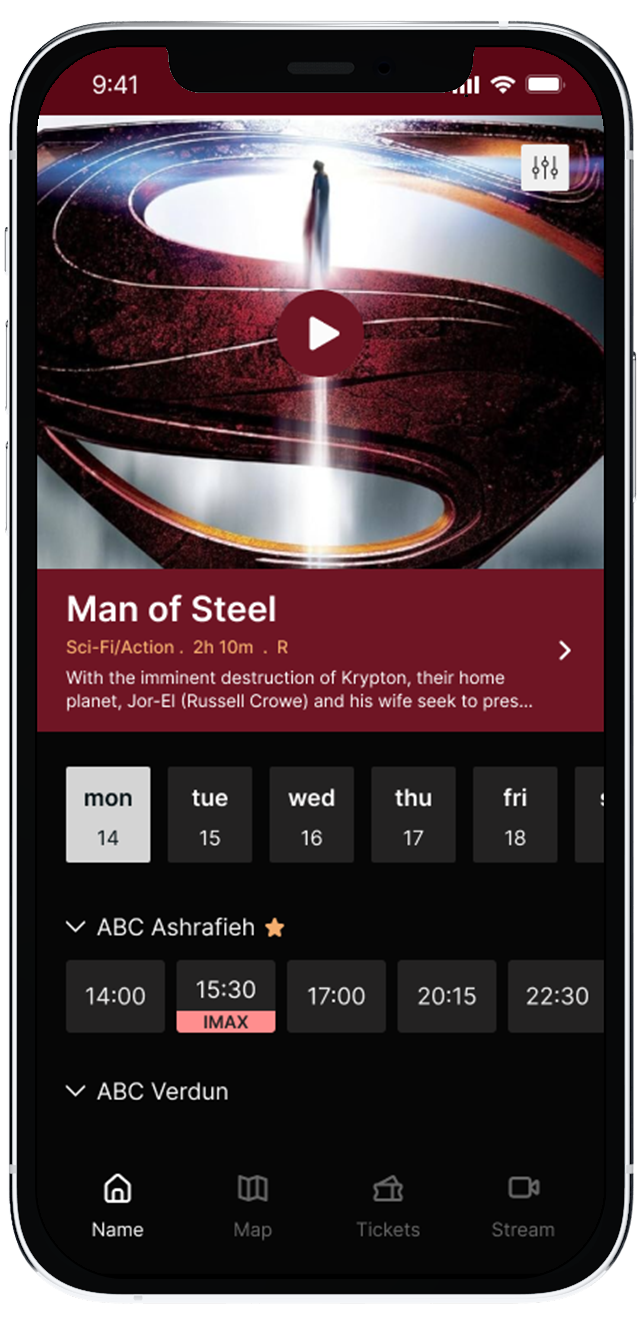
The core of the solution is a single booking screen. Dates, nearby theaters, showtimes and seats sit together, so a decision takes one pass instead of several.
- Theaters are listed side by side, with the favorite one open first
- IMAX showings are tagged on the showtime itself
- Seat availability is visible before committing to a time
- The screen takes its color from the movie's artwork, so every movie page feels like its own
The rest of the trip
The booking screen answered the comparison problem. Five more screens answer the other findings, one finding each. Pick one to see what I heard and what I designed for it.
Theaters near you
Heard"The location, to be close to where I live." Offers only get noticed at the counter.
DesignedHome opens on your favorite theater and today's showtimes, lists the others by distance and format, and puts the current offer where it can't be missed.
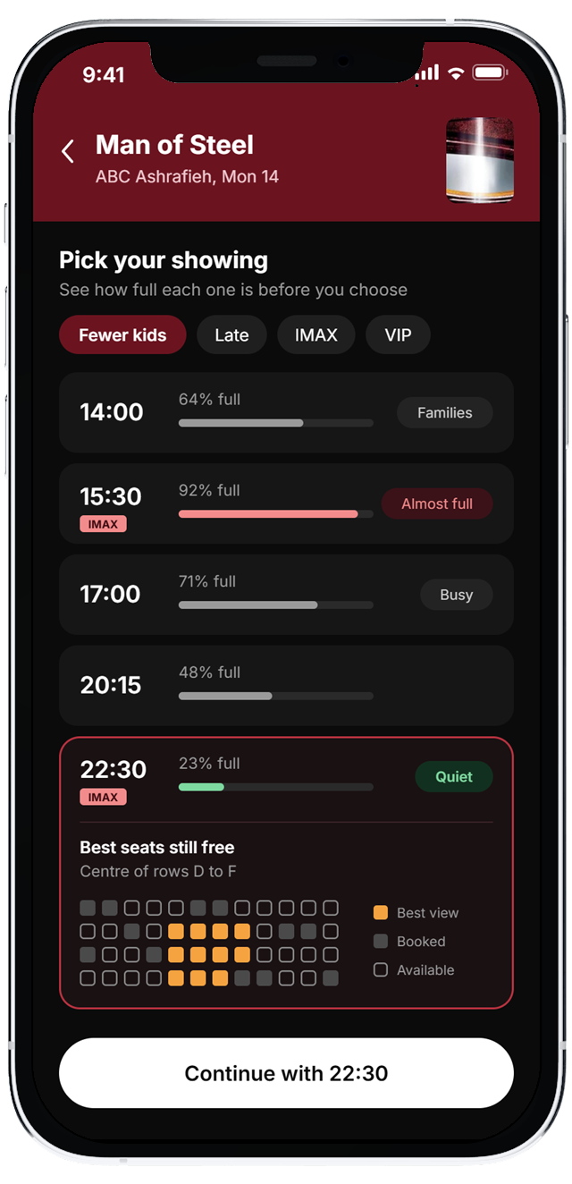
A quieter showing
HeardNoise, phones and kids were the biggest complaint. Some people already book late showings to get an emptier room.
DesignedEvery showtime shows how full it is, with a "Quiet" tag and a "Fewer kids" filter. The chosen showing points to the best seats still free.
Pay your way
Heard"They only offer Lebanese card payment, which is a limitation." Others want to pay cash without losing their seats.
DesignedCard in either currency, a wallet, or cash at the theater with the seats held. No details to type again, and one total for tickets and snacks.
Snacks without the queue
Heard"I have to stand on 2 booths, one for the payment and one for popcorn."
DesignedSnacks are ordered with the ticket and collected from a fast lane or brought to the seat, ready fifteen minutes before the film.
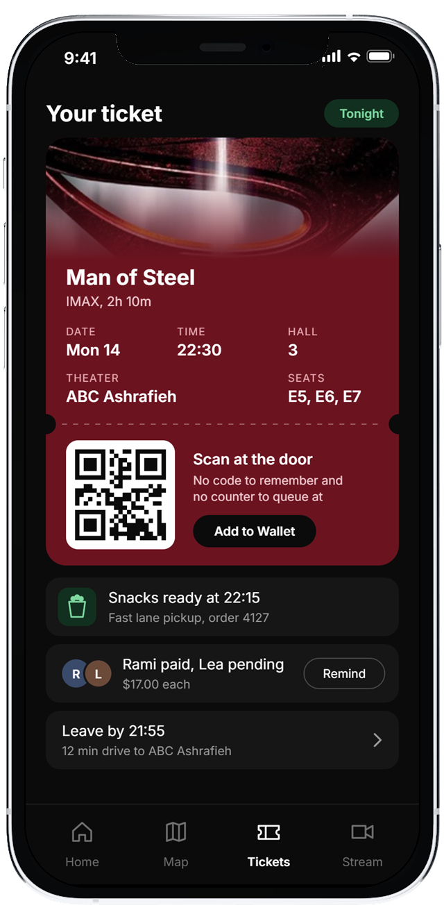
The ticket on the day
HeardA phone reservation code got lost and a group ended up sitting on the floor. Booking for friends means a lot of back and forth.
DesignedOne ticket to scan at the door, with the snack order, who has paid their share, and when to leave. It carries the movie's color, like the booking screen.
Research changes what "simple" means.
Listen first, then design
I expected a booking problem. The interviews showed the booking was only one part: the room, the payment and the queue mattered just as much, and each one became a screen.
A script is a draft
Reviewing my first two interviews changed the questions, and the later answers were richer for it. I now pilot every script before running the full round.
What I would do next
Test the flow with five moviegoers, measure how long it takes to compare two theaters and book, and check whether the "Quiet" tag changes which showing people pick.