Designing the stretch between buying and being online
A travel eSIM app in a crowded market. I designed the flows that take someone from first opening the app to working data abroad.
- Role
- UX/UI Designer
- With
- Mathieu Moussa, Lead Product Designer
- Platform
- iOS & Android
- Launched
- Early summer 2026
A crowded category
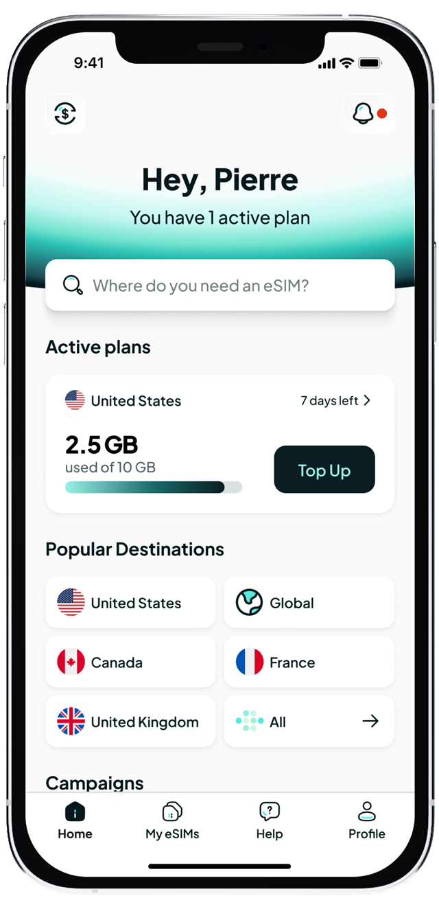
Rowm is a travel eSIM app. Pick a destination, buy a data plan, install it, and land with internet already working. It sells to individual travellers and to companies whose staff travel often.
Dozens of apps do the same thing, cover the same countries, and make the same promises.
Rowm cannot win on coverage, so it has to win on being easy at the moments that matter.
Usually right after landing, before you have internet and can search for help.
Starting with the competition
I gathered screens from around thirteen competitor apps, through Mobbin and by hand, and laid them out flow by flow on one board. We then annotated them together and read through store reviews and forum threads.
The complaints were rarely about price. They were about not knowing whether the eSIM was working.
Installed but not connected. Connected but no data. That shaped almost every decision that followed.
What I owned
I designed three flows end to end: onboarding, checkout, and the tutorial pages people see after installing.
Mathieu set the product direction and led the overall vision. Within that, I also built the most complex components in the design system, including the active eSIM, ready eSIM, and checkout cards.
Onboarding and checkout
Onboarding had one job: get someone to the right plan quickly, without asking for more than the purchase needs.
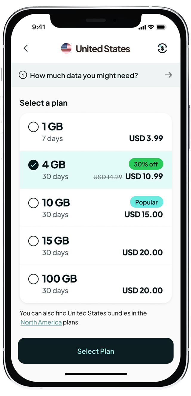
Checkout had to make the plan, the country, and the validity period clear before anyone paid, since buying the wrong plan was one of the most common complaints in competitor reviews.
Guidance after install
Installing an eSIM is where most people get lost. You have to turn on data for a line that is not your usual one, and the plan only activates once you connect to a network at your destination.
The problem wasn't just installation. It was uncertainty.
The tutorial pages walk through those steps and explain the waiting. Without that explanation, a plan quietly waiting to activate looks exactly like a broken one.
Used or remaining?
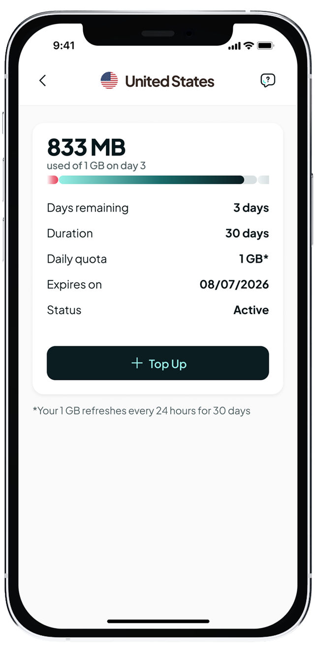
The eSIM card shows how much data a plan has. The open question was whether to show data used or data remaining. I reviewed how competitors handled it, then made the case for "used."
People read a progress bar as something that fills up.
A bar that fills as data is spent matches the number above it and reads correctly at a glance. A bar that drains works against that habit, and it is harder to show clearly, especially when little data is left and the bar shrinks to a sliver.
To check the argument, we showed a prototype of both versions to 12 friends and colleagues.
Several plans, one screen
Business travellers on multi-country trips often hold more than one active plan. Stacking a card for each pushed everything else on the home screen down.
I proposed placing active eSIMs in a carousel.
One plan stays fully visible. The others are a swipe away.
The header shows how many plans are active, so nothing feels hidden.
Cards that carry every state
The eSIM cards were the hardest components I built. A single card has to show a plan that is ready but not installed, active with data left, active with data spent, or expired.
I built each state as a variant in the design system, so every screen that uses a card stays consistent and new states can be added without redrawing screens.
The screens people remember aren't always the ones where they buy.
The biggest lesson for me was that in this kind of product, the screens people remember are the ones they see when something is taking longer than expected, far from home.